Seeing as my first attempt at uploading my 2nd draft of my video came out in much lower quality as expected; I decided to re-upload it after researching more into export settings. An article I found on www.premiumbeat.com taught me that the best format to export a video for YouTube was H.264. I exported my video in this format with the 1080hp 29.97 pre-set. This yielded a much better result than last time however after uploading it to YouTube it was unfortunately again of lower quality than I expected.
Thursday, 12 February 2015

Friday, 6 February 2015
Second Draft of Video
This is my finished second draft of my video. Whilst not having anymore footage; there are no gaps in the filming and I feel I have shown much more skill in editing and the use of effects. However I unfortunately seem to of made in error when exporting the file so it is in lower quality then I would of hoped. I will therefore try to fix this as soon as i can however my absence from college next week will make this difficult to do before my deadline.
Disraeli Gears

This is the cover to Disraeli Gears by Cream. As this was a big inspiration and influence on Kevin Parker and Tame Impala I thought it may be a good idea to look for inspiration that I can take from this album cover or a single image or graphic I can use. This is classic psychedelic cover art; featuring bright colours and numerous patterns and graphics. Therefore it makes it hard to pick one particular image from the cover as a whole. Seeing as I wanted to use one particular standout image; it would be hard for me to use one of the coloured patterns as these are numerous and complex. This leaves me to look and particular graphics from the cover as a whole.

 One particular standout idea is that of the clocks on the bottom left and right corners of the cover. Clocks and time are quite a common feature in psychedelic art and culture so this could be an effective image to use in my own work. It could also relate to the "Backwards" theme of my song and video and I could show the clock hands moving backwards and turning back time. Therefore these are particularly strong contenders from this cover for a graphic for me to use in my own design. However their disadvantage is that they are not particularly noticeable; therefore the association between my use of the clocks and this classic cover may not be recognised; which ruins the point of using them.
Another graphic from this cover is the pink gramophone horns disguised as flowers. I like this image as it represents music as well as the psychedelic imagery of bright colored flowers. Therefore this may also make a strong image to use in my own design. However without other flowers around it the idea of the gramophone disguised as a flower may not work as well; which would mean having to introduce more flowers which would ruin my idea of having just one main graphic.
The final image from this cover that I have considered using is the wings on the side of the band name. I think these are some of the more iconic graphics on the sleeve and they are brightly coloured and fit in with the psychedelic theme of nature; so they would therefore make a good graphic to use in my design.
While I like all these ideas; I think the idea of the clock or the wings are stronger than the idea of the gramophone. And I think as a singular graphic, the image of a clock would be stronger and more iconic than that of the wings. The image of the clock is also more related to my backwards theme so is therefore the strongest candidate of the three. However i still may experiment wit the other two when creating drafts.
Thursday, 5 February 2015
Editing For Second Draft
Seeing as I will not be able to film any more footage for the second draft of my video; I have started to get much more into the editing side of things to improve the quality of my current footage and achieve the psychedelic feel that I planned. Through experimentation on Premier Pro I discovered a number of techniques that I have started to learn to use to create the desired effects and make my video seem more professional

 One important effect I used was the "dip to black" video transition. This is important in the opening seconds of my video to fit in with the on the beat transitions between shots. It is also needed later in my video for the parts filmed in the wooded area. I used this transition by dragging it across from the effects library and onto the end and beginning of the two clips I want to edit together. I then fine tuned the positioning and the length of the transition until I achieved
the desired affect.


An effect I have used to create the psychedelic feel of the video was the solarise effect from the stylize section of the effects panel. This effect was very effect in some shots, especially when applied gradually. I did this by making a duplicate of the clip I wanted top use and putting this is a separate channel to my original clip. I then dragged the solarise effect from the effects panel and applied it to the duplicate clip. I then used automation on the opacity control for the effected clip so it gradually increases creating the illusion of the solarise effect gradually gradually taking over the dry clip. On this particular shot I also used the replicate tool to create the panel effect that is reminiscent of psychedelic 60's pop art like that of Andy Warhol; particularly his famous picture of The Beatles.


I used the same technique when using the Colour Emboss effect to create a grainy cartoon effect on another sequence. However this time I used the automation on the opacity control to create a line linking over three separate clips which required me to set the levels of opacity very accuratelyto create a straight rising line.
Finally to create my shot that i marked in my story board as just as "Psychedelic Effects", I took a short sequence of film that didn't include my actors and applied numerous effects to it using the opacity automation method I previously described. On my wet clip I applied solarise and threshold effects to create a psychedelic and almost cartoon type effect which then melts into the next shot with a twirl effect transition that I found in the preset library. However to make this effective I also had to apply a dip to black transition on my dry clip so that it seemed to "disappear" properly. I have found this mix of effects very useful for filling in the gaps where in my footage and really achieve the psychedelic feel I was hoping for.


These are just some examples of the many effects I have used and I felt it was important to show them as they are a vital part of the editing process and the video in general.
One important effect I used was the "dip to black" video transition. This is important in the opening seconds of my video to fit in with the on the beat transitions between shots. It is also needed later in my video for the parts filmed in the wooded area. I used this transition by dragging it across from the effects library and onto the end and beginning of the two clips I want to edit together. I then fine tuned the positioning and the length of the transition until I achievedthe desired affect.
An effect I have used to create the psychedelic feel of the video was the solarise effect from the stylize section of the effects panel. This effect was very effect in some shots, especially when applied gradually. I did this by making a duplicate of the clip I wanted top use and putting this is a separate channel to my original clip. I then dragged the solarise effect from the effects panel and applied it to the duplicate clip. I then used automation on the opacity control for the effected clip so it gradually increases creating the illusion of the solarise effect gradually gradually taking over the dry clip. On this particular shot I also used the replicate tool to create the panel effect that is reminiscent of psychedelic 60's pop art like that of Andy Warhol; particularly his famous picture of The Beatles.
I used the same technique when using the Colour Emboss effect to create a grainy cartoon effect on another sequence. However this time I used the automation on the opacity control to create a line linking over three separate clips which required me to set the levels of opacity very accuratelyto create a straight rising line.
Finally to create my shot that i marked in my story board as just as "Psychedelic Effects", I took a short sequence of film that didn't include my actors and applied numerous effects to it using the opacity automation method I previously described. On my wet clip I applied solarise and threshold effects to create a psychedelic and almost cartoon type effect which then melts into the next shot with a twirl effect transition that I found in the preset library. However to make this effective I also had to apply a dip to black transition on my dry clip so that it seemed to "disappear" properly. I have found this mix of effects very useful for filling in the gaps where in my footage and really achieve the psychedelic feel I was hoping for.
These are just some examples of the many effects I have used and I felt it was important to show them as they are a vital part of the editing process and the video in general.
Tuesday, 3 February 2015
Ancillary Text Planning
I think the main point I have taken from my ancillary text research is that the best album covers have a singular main feature on the design whilst trying to reflect the feel of the music. This therefore will be the main idea I take into account when creating my own design. The other technique that I thought was successful in creating a good design was inter-textually referencing other albums that may of had an influence on the music. Therefore I may also use this when creating my own design as it may be easier to find some inspiration from other work; as well as making my design more interesting.
To try and find out what other albums may have influenced Tame Impala's music. My research took me to a very useful "Soundtrack To My Life" article form the Guardian website by Kevin Parker; Tame Impala's songwriter and singer.

 This article led me to discovering a couple of big influences on Tame Impala's sound. Cream's "Disraeli Gears" album was the record that got Parker into Psychedelic rock. He describes how he discovered it in his early 20's and its rumbling, fuzzed-out sound "Blew his mind". The other album that I found in the article was "Talkie Walkie" by Air. Parker described this album as the album that had the most influence on tame Impala's sound and that made him release music "doesn't have to sound like a band". It's huge layered and varied electronic sounds are a big influence on the sound of the band so taking something from the albums artwork may be effective.
To try and find out what other albums may have influenced Tame Impala's music. My research took me to a very useful "Soundtrack To My Life" article form the Guardian website by Kevin Parker; Tame Impala's songwriter and singer.

 This article led me to discovering a couple of big influences on Tame Impala's sound. Cream's "Disraeli Gears" album was the record that got Parker into Psychedelic rock. He describes how he discovered it in his early 20's and its rumbling, fuzzed-out sound "Blew his mind". The other album that I found in the article was "Talkie Walkie" by Air. Parker described this album as the album that had the most influence on tame Impala's sound and that made him release music "doesn't have to sound like a band". It's huge layered and varied electronic sounds are a big influence on the sound of the band so taking something from the albums artwork may be effective.
More research led me to discovering that the album; "A Wizard, A True Star" by Todd Rundgren was also a very big influence on the sound of Tame Impala; specifically on their 2012 "Lonerism" album that the song I am using is from. Therefore I think it would also be a good contender for any inspiration taken for the cover art as it would directly reference this influence on the sound. 
Monday, 2 February 2015
Ancillary Text Research 2
Following my research into the conventions and successes of album covers from a broader musical spectrum, I decided to look more into album art within the psychedelic genre.


 One of my favourite psychedelic album covers is "K" by the 90's Indian-influenced psych band Kula Shaker. The cover art is designed by comic-book artist Dave Gibbons. It features a generic bright psychedelic colour scheme which is a common feature of psych albums and is therefore something i may use in my own design. The main feature of the album is an image of the Hindu god Krishna; which reflects the Indian musical influence on the sound of the album which is a technique I have discovered in my previous research of album art from a wider musical spectrum. However I think the most interesting aspect of this design is the characters in blue. All these characters are people or things that's name begin with K; such as Lord Kitchener, Martin Luther King, a Knight and Karl Marx. This is very interesting as a design and as an example of a post modern text as it continues numerous inter textual references to each character; especially so with characters from other media texts such as the film "King Kong". It can also be seen as a pastiche of or reference to the classic Beatles album cover for "Sgt. Pepper's Lonely Hearts Club Band" which is a classic 60's psych album which may have influenced the music of this album. The cover art of the Beatles album; by pop artists Peter Blake and John Haworth features a collage of life sized cardboard cut-outs of various famous people. I think this was purposely referenced by Gibbon's when he created the artwork for "K" and is an idea that I could use myself; pastiching a classic psych album's artwork.

 Another psychedelic album that I like the artwork of is Tame Impala'a own first album "Innerspeaker". This album cover; designed by Leif Podhajsky, is originally a picture of the Great Smoky Mountain Range National Park in North Carolina. This image has been digitally edited to create a "Droste Effect" to make it appear as if the picture infinitely continues into itself, which creates a very psychedelic image. This theme of trippy scenery and nature is a common theme in psychedelic art and is therefore something I should consider including in my own design. The psychedelic artwork on the cover also reflects the psychedelic nature of the music to the audience; which is an important factor of it's success. Another interesting feature is that this use of the Droste Effect has been used in Pink Floyd's "Ummagumma" album; an album from when Pink Floyd were bridging across from Psychedelic to Progressive Rock; again showing a use of possible pastiche and intertextual referencing, which is beginning to become a theme I have discovered in psychedelic album art.

 One of my favourite psychedelic album covers is "K" by the 90's Indian-influenced psych band Kula Shaker. The cover art is designed by comic-book artist Dave Gibbons. It features a generic bright psychedelic colour scheme which is a common feature of psych albums and is therefore something i may use in my own design. The main feature of the album is an image of the Hindu god Krishna; which reflects the Indian musical influence on the sound of the album which is a technique I have discovered in my previous research of album art from a wider musical spectrum. However I think the most interesting aspect of this design is the characters in blue. All these characters are people or things that's name begin with K; such as Lord Kitchener, Martin Luther King, a Knight and Karl Marx. This is very interesting as a design and as an example of a post modern text as it continues numerous inter textual references to each character; especially so with characters from other media texts such as the film "King Kong". It can also be seen as a pastiche of or reference to the classic Beatles album cover for "Sgt. Pepper's Lonely Hearts Club Band" which is a classic 60's psych album which may have influenced the music of this album. The cover art of the Beatles album; by pop artists Peter Blake and John Haworth features a collage of life sized cardboard cut-outs of various famous people. I think this was purposely referenced by Gibbon's when he created the artwork for "K" and is an idea that I could use myself; pastiching a classic psych album's artwork.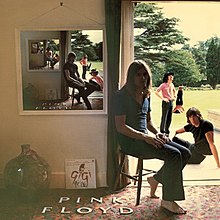
 Another psychedelic album that I like the artwork of is Tame Impala'a own first album "Innerspeaker". This album cover; designed by Leif Podhajsky, is originally a picture of the Great Smoky Mountain Range National Park in North Carolina. This image has been digitally edited to create a "Droste Effect" to make it appear as if the picture infinitely continues into itself, which creates a very psychedelic image. This theme of trippy scenery and nature is a common theme in psychedelic art and is therefore something I should consider including in my own design. The psychedelic artwork on the cover also reflects the psychedelic nature of the music to the audience; which is an important factor of it's success. Another interesting feature is that this use of the Droste Effect has been used in Pink Floyd's "Ummagumma" album; an album from when Pink Floyd were bridging across from Psychedelic to Progressive Rock; again showing a use of possible pastiche and intertextual referencing, which is beginning to become a theme I have discovered in psychedelic album art.
The last design that I find interesting is that of Allah Las's self titled debut album. I think this is an interesting design because it is a simple but iconic drawing rather than a series of graphics or an interesting photo like most album art within the genre. I also think this is a successful design because it reflects the simple form of the bands music compared to their contemporary's within the genre. But I think the main reason I like this design is that like my favourite designs from my previous research; it has only really got one main focus and that is the picture of the woman holding the sea shell to her ear. I believe this one single image makes the design as a whole stand out more rather than a more complex design with a number of graphics and is therefore something I will most likely use in my own design. 
Filming
Unfortunately my main actor; Tom, had to pull out of filming last minute due to illness. This meant that I could not get any filming done as he in crucial to almost every shot in my planned product. This has set me back considerably as I am away for a week from next Sunday onwards which means I may struggle to find another date to film in time for my deadline on the 13th. However in terms of editing I am getting to grips much more with using Premier Pro and getting much more into the effects side of the process. Therefore I feel that even without new footage I can deliver a considerably improved second draft compared to my first one. Also in hindsight the weather was quite bad on Sunday with considerable rain which would not of been good for the camera and would of made filming on Beverley Westwood more hazardous due to muddy and slippery conditions.

Subscribe to:
Posts (Atom)