Monday 20 April 2015
Evaluation Question 4
Details of the editing process and my use of Adobe Premier Pro can be found in the editing section of my Textual Analysis of my product.
Evaluation Question 3
3) What have
you learned from your audience feedback?
In order to advance in the development of my product I used
asked people for feedback on a draft version of my video. I also showed them my
ancillary texts and asked for feedback on these as I feel they are an integral
part of my product. In order to get some
useful feedback I came up with a series of questions that I felt covered
appropriate areas of my product that I felt I could develop.
1). How effective do you think the use of the three
mise-en-scenes is?
For question one I received only positive feedback in
relation to my mise-en-scene. The general consensus was that the location of
the busy street was effective in displaying the actor’s performance, especially
in the fast reverse scene where the performer stands still whilst the public
walk by. The feedback also taught me that the location of the bedroom was very
effective for showing the lip syncing performance side of the video and that
the wood mise-en-scene helped to reflect the lyrics of the song. One of my
interviewees also mentioned that the constant use of the same costume
throughout the text was good for the continuity of the product, inferring that this
use of a music video convention made the product seem more professional. This
positive feedback helped me learn that my use of mise-en-scene was as effective
as I thought, so I continued using the same 3 locations in the construction of
my product.
In relation to question two, I received mixed feedback about
my ancillary texts. Whilst all my interviewees understood the links between the
ancillary products and the main video such as the way the image of the clock
ties in with the theme of time going backwards and the use of stills from the video
for images on the ancillary product promotes continuity and synergy, however
one of my interviewees felt that the main image of the digipak was not as
effective as it could be; suggesting an image of my actor with the public
walking around him in the street may have been more effective. I can understand
this suggestion as the standing shot from my video where the public walk past
my actor in fast reverse is probably the most striking and standout shot of the
video, however I felt this drawing helped fit in with the psychedelic
convention of the hand drawn art aesthetic.
I received all positive feedback in relation to question
three of my feedback. All the interviewees agreed that the product was
effective in its use of effects in displaying generic psychedelic conventions.
The feedback told me that the swirl effects and bright colour washes were the
particularly effective edits in conveying these cliche conventions. I therefore
used this feedback to make sure I continued using these particular effects
throughout my editing process. This feedback was particularly influential on
the collage of colour washes I used on the second to last shot in my final
video.
I received mixed feedback in relation to question four about
the narrative structure. Two of my interviewees said that the narrative
structure was easily understandable whereas one said it was not and that there
was no clear story. I think this is probably because there isn’t much narrative
within the video which is mostly abstract in nature. However when I showed my audience this draft,
the end part of my video was not finished which helps to tie what narrative
structure there is together. This feedback therefor helped me as I used the
fact someone hadn't understood the narrative elements to make sure they were
made obvious in the end part of the video with the re-introduction of the girl
character.
For my final question I received quite simple positive
feedback from all my interviewees in relation to the theme of the video suiting
the song. . The only particular comment I got was that the theme of the video
especially fits the lyrics. This feedback helped me continue with the
production of my product as it let me know that my main idea was as effective
as I thought it would be.
In conclusion I felt that this use of audience feedback did
help me in some ways as I had not fully finished the editing process of my
video when I showed this audience my product. It therefore helped me with the
final stages of my video, especially in making sure the girl character had a
bigger role in the last part of the video to make sure the narrative elements
of the video were made clear. However much of the feedback was positive and
simply agreed with what I was already doing so this, while not particularly
constructive, encouraged me to finish the video the way I had planned and not
make any big changes. My audience feedback was therefore fairly helpful in the
construction of my final product, but only particularly effected how I used
more shots of the girl in the ending sequence.
Evaluation Question 2
2) How
effective is the combination of your main product and ancillary texts?
To help me answer this question I conducted a LIIAR analysis of both my ancillary texts. These presentations answer some of the aspects of this question so became a useful resource.
I think the main way in which the combination of my main product and my ancillary texts are similar is through the way in which they both stick to conventions of the psychedelic genre. My main product and magazine advert for example; follow the psychedelic conventions of trippy visual effects and nature scenes, whilst my Digipack cover features drawn art and a general hand drawn style design and font which is shared with my magazine advert. Both of these are features of classic psychedelia therefore promoting continuity and synergy through how they both use psychedelic conventions and features to exhibit the products as one package, despite some major visual differences.
Another way in which the combination of my main product and my ancillary texts are effective is the main image on my digipak front cover. Asides from the fact that it's drawn art fits in with the psychedelic conventionality of my product in general, the image of the clock can be associated with the "backwards" theme of the video, as the clock signifies the time that is turned back during the video. This therefore shows the theme being promoted throughout the whole product, demonstrating synergy and continuity which leads to an effect combination of the products. This use of the clock image is also an example of the uses and gratifications audience theory as it relies on the audience to make the semiotic connection between the theme of the video and the image.
Another way in which I believe I created an effective
combination was through my use of images on the products. My images on my
magazine advert and on the inside of my digipack cover are both stills from my
music video. This demonstrates part of the ideology of my main product which is that of psychedelic imagery and effects in an everyday environment. The images on both the digipak and magazine advert are perfect examples of this ideology as they show the performers in fairly normal and everyday locations in the street and by the wall but with psychedelic visual effects such as spherise and solorise. This helps to make an effective combination as it promotes
synergy through it's sharing of the same ideology. It is also an effective combination of products can also help its target audience link the products if they have
seen one of them by the continuity of the images; which relies on the uses and gratification theory as the audience need to use their knowledge of one product it link it with the other.
In a similar way, both my ancillary texts combine together effectively by sharing a number of conventions such as the use of the record company logo as well as the same font and hand drawn style design. This along with the use of images from the video helps to promote synergy within my ancillary texts to help them combine effectively themselves, especially seeing as teh magazine adevrt is more likely to be linked to the digipak than to the video.
In conclusion I believe that through a number of ways the combination of my ancillary texts and my main product is quite effective thanks to the synergy and continuity of certain themes and ideas throughout my entire product such as the use of images and psychedelic conventions.
Evaluation Question 1
In what ways does your media product use, develop or challenge forms and conventions of real media products?
My main product was a music video I created for the Australian psychedelic-rock band Tame Impala's song "Feels Like We Only Go Backwards" from their 2012 album "Lonerism".I have completed a full textual analysis of my product in which the answers to many of the questions in relation to conventions of real media products can be found:
My product both uses and challenges the conventions of regular and psychedelic music videos. Some particular conventions that my product uses include on the beat editing, repeated mise-en-scene, lip syncing, elements of conventional narrative and visual effects.
Probably the first obvious use of a generic convention of music videos is the use of beat editing is in my opening sequence. I used the premier pro fade to black transition to switch between shots on the four bass beats in the opening seconds of the song. I thought this was appropriate as it introduces the narrative situation of the boy and the girl before the main part of the songs and the main part of the video. When this transition is used quickly it creates a blinking effect which I thought was effect in the way it shows the boy and girl being together as this could create connotations of dreaming or of time going fast “like the blink of an eye”. The on the beat editing also is effective immediately after this sequence in how it the video explodes into backwards slow-motion when the song “drops”, letting the audience know that this is the main part of the video. This use of on the beat editing is an example of sychronisation between the song and the video. Other moments that have a similar effect are during the last part of the song in which the psychedelic effects of the video intensify as the song comes to a climax and at the end of the song when the last clip fades away as the music fades. These are both again examples of on the beat editing and song song synchronisation which are a fairly vital and heavily used convention of music videos.
My Video uses three main repeated mise-en-scenes, which is another convention of music videos; the street, the wooded area and the bedroom. I used the street and the bedroom to try and promote the idea of the contrast of a psychedelic video and song set in a very ordinary location which I planned from the start The street was a particularly effective mise-en-scene as it allows the audience to clearly make out the performance of the actors compared to the ordinary life of the public around them. It was also very effective in highlighting the isolation of the main character compared to that of the people around him, especially in the shot of him standing still whilst the rest of the world passes him by in fast motion. This in a way could also be seen as a development of conventions as it is taking the traditional concept of a psychedelic video and applying it a modern day setting. However at the same time I did use the wooded area filming location to re-enforce some classic psychedelic mise-en-scene to show how the video still sticks to the roots of the genre. The calm and open wooded area creates a major juxtaposition when compared to the busy street of the previous mise-en-scene creating an effective metaphor for the characters isolation and loneliness. I found the use of natural settings such as a wood/forest or a desert a typical convention of other psychedelic music videos in my research.Two particular videos that I found in my research that use these natural settings are "Follow You Down" by Allah La's and "Expectation" by Tame Impala. This use of similar setting in other videos particularly shows how I have used the conventions of real media products in my project.
The most generically psychedelic convention I used was the heavy use of visual effects I created in the editing process. I particularly used the polarize and replicate effects to create classic trippy 60's psychedelic effects. I used a lot of effects because I used quite an every-day mise-en-scene with the street and the bedroom. This helped to promote my idea of psychedelia in a very normal and everyday background, however it required quite a heavy use of these effects to reflect this idea in mise-en-scenes that are not traditionally associated with psychedelia. Details of each effect and how I used them can be found in my textual analysis which I posted above. However I feel that this use of effects is a very good indication of how my video has used the codes and conventions of real psychedelic music videos.
My ancillary texts include a number of codes of conventions in the way they are set out. There are some very generic features on both of these products which are highlighted in these LIIAR analysis presentations:
#
 |
| My Magazine Advert |
 |
| My Digipak |
 |
| A real magazine advert using similar codes and conventions to mine |
One way in which I developed conventions was through the use of one of my main editing techniques: putting the clips in reverse. I came up with the idea of using reverse filming after seeing the video to "F.E.A.R." by Ian Brown, which also uses reverse filming throughout the whole video. This therefore shows a development of conventions as it shows me taking inspiration from one idea but changing it to fit my video which only uses reverse filming in some parts rather than through the whole video. This is also an example of my video as a post-modern text as it uses intertextual referencing and as an example of Michael Shore's recycling of styles theory as it uses the reverse feature made famous by the 2001 Ian Brown video. It therefore shows the development of conventions because I took an idea from one video and applied it to the concepts within my own more modern product
.
Another way in which my product could be seen as developing and also challenging the conventions of psychedelic conventions is through the main design on the digipak cover. I took the idea of taking inspiration/pastiching other classic psych albums from the way Kula Shaker's "K" references The Beatles's "Sgt. Pepper's Lonely Hearts Club Band" with the multiple card board cut out characters and Tame Impala's use of the Droste effect on their "Innerspeaker" album referencing Pink Floyd's "Ummagumma".There is a deeper analysis and explanation of these references in my ancillary text research blog post. I used this idea to come up with my design by borrowing the idea of an image of a clock from the cover of Cream's "Disraeli Gears" and using it as the main focus on my cover. I used this particular album as Kevin Parker; who wrote the song I am using, cited this particular album as a major influence so I therefore thought it would also make sense to use this album for inspiration in terms of artwork. This method of design therefore relies on the uses and gratications audience theory, relying on the audience's knowledge of music to work out what the clock signifies. I believe this shows the development of conventions as I used the technique of referencing/pastiching that I found in other psychedelic album covers and brought it into a more modern context, while not directly using the same original image but using an image of the same object.
 |
| Sgt.Peppers Cardboard cutout characters |
 |
| K's Blue characters which can be seen as a reference to Sgt.Pepper's |
 |
| Ummagumma uses the endless mirror Droste Effect |
 |
| Innerspeaker's use of the Droste effect can be seen as a reference to Ummagumma |
 |
| Cream's Disraeli Gears, with the clock in the bottom left corner |
 |
| My Digipak cover, using a clock to subtly reference Disraeli gears |
One way in which I challenged the conventions of regular music videos was through the way in which I created a video that was abstract in nature but also contained elements of narrative; shown through the appearance of the girl character, at the beginning and end of the video. Whilst most videos either follow an abstract or narrative path mine is a hybrid. Whilst video is mainly abstract with elements of narrative, the narrative elements that there is would be called a story rather than a plot if you were to apply the narrative theory of Tim O'Sulivan as the narrative can only be interpreted from the few scenes with the girl character that are presented along with what the audience infers; which therefore also supports the uses and gratifications audience theory. My video contains elements of performance shown through the actors lip syncing (but not including any sort of band performance) but also elements of acting, meaning it is neither what Sven Carlson would call a performance clip or a narrative clip. I used this personal performance style as I thought it best suited the theme of isolation and the aesthetic of the song and video rather than using the more generic band performance shots found in other videos. I created a hybrid video in terms of narrative and performance as I felt that this mix up of different music video styles fitted well with the psychedelic genre and I also found that other videos such as Allah La's "Follow You Down" (posted above) do the same thing; mixing performance, abstract film and narrative. This creation of a hybrid style of video therefore shows me challenging the normal conventions of music videos.
Perhaps another way in which my video challenges conventions of real music videos is it's rejection of some common media theories. One media theory this video rejects is Tessa Perkins stereotype theory. Whilst my song is part of the psychedelic genre, the characters within my video do not fit this stereotype. Expected stereotypical characters may have long haired, wear bright colours and 60's/70's style "Hippy" clothing. However I instead decided to use costume more associated with the broader ranging indie genre, to help promote my ideology of psychedelia in an everyday environment as it is quite uncommon to see someone dressed in a stereotypical psychedelic fashion.
Another common theory that this text rejects is Richard Dyer's star theory. This theory is not applicable to this text as it is not made clear if the performer in the video is actually the musical artist, therefore the lip-syncing scenes, therefore rendering the star theory irrelevant. However the genre of the song does not lend itself to the star theory either as it is not a widely accessible genre like pop and is catered to a niche audience.
Another common theory that this text rejects is Richard Dyer's star theory. This theory is not applicable to this text as it is not made clear if the performer in the video is actually the musical artist, therefore the lip-syncing scenes, therefore rendering the star theory irrelevant. However the genre of the song does not lend itself to the star theory either as it is not a widely accessible genre like pop and is catered to a niche audience.
Friday 17 April 2015
New Magazine Advert
Despite previously posting what I thought would be the final draft of my magazine advert ancillary text, during question 2 of my advert I realised that there was little continuity between this ancillary text and my digipak. Seeing as i spent more time researching my digipak design and it's themes I decided to recreate my magazine advert using more continuity with my digipak, such as the paper look background colour and the hand-written style Mistral font. This new design promotes more continuity between my products and especially helps my audience associate my advert with my digipak; improving it's advertising properties.

Friday 27 March 2015
Video 3rd Draft
This is the latest draft of my video. I am now missing only 40 seconds of footage and I am very satisfied with the way the video is going. The only issues I am currently facing are some imperfect lip syncing at points in the the second half of the video but apart from this I am very happy with the results so far.
Thursday 26 March 2015
Postponing Of Filming
Unfortunately due to personal circumstances, Izzy had to drop out of filming tonight. This has thrown my hopes of completing my video before Friday out of the window; however having talked to my teacher I have arranged to organise the rest of my filming for next week and to just try and complete part of my evaluation for Friday whilst posting another draft of my video so far.
Monday 23 March 2015
Filming Plan 24/03/15
On Tuesday I plan to film the remaining shots for my video featuring both Tom and Izzy and the shot of the glass smashing. The weather is set to be a good 9 degrees Celsius and the brighter nights allow me to have more time to film after college. Once I have these remaining shots I only have 40 more seconds of editing to do before my video should be finished in time for my deadline.
Friday 13 March 2015
Magazine Advert
This is my finished Magazine advert. It includes many conventions of other magazine adverts such as the masthead title of the band name, ratings from magazines and information about the available formats of the product. I used a traditional psychedelic colour of purple as my background and used an arabic style font to represent my product as part of the psychedelic genre as eastern influence is a big part of psychedelic music and culture. Seeing as I could not have a picture of the actual artist I used a still from my video for the main image. I used this particular image as it is part of the video that uses a solorised effect that represents the trippy and psychedelic feeel of the music as well as fitting the colour scheme of the advert.

Digipack
This is my design for my digipak. It incorporates my cover design along with some conventional features of back covers such as the record company label, a bar code and small print. It is mostly stylistically similar to my cover design for continuity.

Creating My Own Design
I had already decided on my background colour and font I wanted to use. I used the Mistral font; which is a vintage script style font that I liked using on my previous drafts. I also decided to using the "strong" setting on my artist name to bolden it as this was an idea given to me by feedback from peers. For my background I used a very pale shade of yellow to create an old parchment/paper look reminiscent of the artwork for "Talkie Walkie" by Air.
Now came the issue of getting my main image of the clock. I am not a talented drawer or artist so i asked a friend who is an graphics student to draw a clock for me after showing her my ideas. She sent me this the day after and I was very happy with it. I scanned it in and put it onto Photoshop. After some struggle recolouring the white parts of the paper it was originally drawn onto; I eventually got it to fit into my pre-made design fairly easily. I am happy with the results of this as my front cover as it is almost exactly how I imagined it in my head, therefore I am satisfied that I can now move on to designing the rest of the digipak.


 |
| Selecting the Mistral font I had used in my drafts |
 |
| Using the strong text preset to bolden my artist name |
 |
| Selecting my parchment/paper style background colour. |
Final Cover Drafts

 I had now narrowed down to my two favourite ideas from both the "Disraeli Gears" inspired clock and the symbol from the "A Wizard, A True Star" album art. I liked the strong symbol from the Todd Rundgren inspired design and the way it stood out from the page more than the clock design. However I feel that the hand-drawn style fitted in with the conventional psychedelic feature of art. I also am a big fan of the idea of the clock symbolising the turning back of time and the way it's hand drawn style also emitted a feel of childishness; which is yet another feature of psychedelia. I therefore chose this idea to use in my own design.
Thursday 12 March 2015
Digipak Template
Now I have some advanced plan designs for my front cover, I must turn my attention to the rest of the digipak packaging. I must now consider, as well as the front cover, the back cover, left inside and the the disks themselves. However I feel that due to my minimalist style I have created on the front cover; it should not take too much time to design the other panels.

Wednesday 11 March 2015
A Wizard, A True star drafts


I created these mock-up drafts playing with the imagery and ideas I borrowed from the cover of "A Wizard, A True Star" by Todd Rundgren. As well as the woodblock idea, I played with a couple of the smaller graphics found withing the artwork. While I think that the woodblock idea was successful to some extent, I don't think it is an idea that I will follow up because I don't believe it suits the music or it's message and the influence of the Todd Rundgren is barely noticeable. I think the most successful design from these set of drafts is the first one shown here; which uses part of the cube in the bottom left corner of the album cover. It provides a strong logo type graphic that I was looking for when I decided what I wanted to do with my cover design.
Monday 9 March 2015
Digipack Magazine Advert Research

I decided to look at some real examples of magazine adverts for albums to try and explore their conventions and look for inspiration for ideas I could use myself. I took examples from a number of artists of varying genres and tried to see what they all had in common. The most prominent feature I found was a mast-head style title that was usually the artists name at the top of the advert. There were a few exceptions such as the Razorlight and You Me At Six adverts shown here which had the artist name in a more lower-central area. Another common feature I found was the use of a picture of the artist, with the few exceptions using the artwork from the album instead. Other notable features include reviews from magazines and information about the format the product is available on etc. These basic ideas set a fairly broad and generic structure that would be easy to recreate in my own design.
Thursday 5 March 2015
Summary of 1st Mock Drafts
While I think all the images had their own appeal; such as the vintage 60's/70's value of the baby blue clock, I think my favorite image was the hand-drwan style clock. I like how it brings forward again this theme of childhood, how it fits in with the psychedelic theme of art and drawing and hwo it especially suits the font and and background; combining my ideas taken from the Air album cover as well as the clock image I have used from Cream's "Disraeli Gears". However i am also a big fan of the bolder font of the draft with the brass alarm clock so i have decided also to try and combine the two to see if it works.

Ancillary Mock Drafts 1
I decided to start making some plans for my actual design using some of the ideas that I found in my research. Though I had decided on a paper/parchment type blank background and a script style font inspired by the cover of "Talkie Walkie" by air, I still wasn't sure which graphic to use. I decided at first to try making some images using the idea of a clock as a graphic. I got some varied clock images from Google images and had a look at the type of ideas I could come up with with my base background and font ideas.


Sunday 22 February 2015
A Wizard, A True Star

This is the cover artwork to "A Wizard, A True Star" by Todd Rundgren. Kevin Parker has said this album was particularly influential on the sound of "Lonerism"; the album my song is taken from. This therefore could be a very good album to take an artwork Idea from. The artwork consists of A main image of a face along side a number of psychedelic images. It is these images that I think would best work as part of my own design. I have a number of options to use here. These include the 3D effect logo in the bottom left corner, the woodblock children's toy used for the text, and the various stars/shapes dotted around the image.


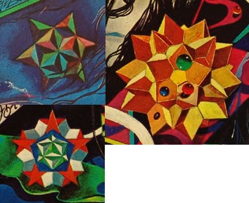
The final part of this design that I have considered using in my own design is the numerous star/pattern images used throughout the design. While these images are good single images that could be used. I feel that many of them are too complex for the sort of design I was thinking of and probably not as noticeable as part of this album artwork. However they do fit the psychedelic theme of the song and are strong images so i may experiment with recreating some of these.
Friday 20 February 2015
Filming 20/02/15
Despite the set back of Izzy being ill and unable to attend the filming; today I got a good amount of footage filmed. I managed to film all my scenes on the Westwood and a number of shots against the wall. I also manged to film more walking shots which I need to use multiple times in my video as well as some films of the Westwood environment to use in my "psychedelic effects" shots. This leaves me with only a few more shots that need filming. These include the glass breaking shot and the shots at the end of the sequence that include Izzy. I now have the majority of the body of shots I need to complete my work so as soon as I get back to college I will start spending much more time editing.
Thursday 19 February 2015
Filming Plan For 20/02/15
 I have decided that I will try to film all my remaining footage tomorrow on Friday the 20th February. I have contacted my actors via Facebook's messaging service to confirm the date with them and both have said they can do it.
The weather forecast shows that it will be a cloudy and warm day with low precipitation which is pretty much perfect conditions for what I want to do and fits in with the weather in my previously filmed shots.

Tuesday 17 February 2015
Filming 17/02/15
Today I managed to successfully film a number of shots that I need for my video. These consisted of the shots of my actor lying on his bed. Before filming I organised my storyboard to bring the shots that I need to the front so I knew exactly what i was filming and how I was doing it.

The filming was quite successful. I got all my basic shots filmed to a good standard with good framing and good lighting conditions. However when we were setting up to do my last shot of the day; the shot of Tom falling onto the bed, my camera battery malfunctioned so we could not film. However apart from this I think it was a successful day and it is very satisfying to finally have some new footage to work with. I hope to film further footage later this week.

The filming was quite successful. I got all my basic shots filmed to a good standard with good framing and good lighting conditions. However when we were setting up to do my last shot of the day; the shot of Tom falling onto the bed, my camera battery malfunctioned so we could not film. However apart from this I think it was a successful day and it is very satisfying to finally have some new footage to work with. I hope to film further footage later this week.
Health and Safety
The environment I am filming in is quite a small room so there are a few health and safety notes for me to think about. We must be careful that all loose wires on the floor are tidied in one place or swept away to avoid any tripping up etc. Another thing we must be careful of is making sure the tripod and camera themselves are secure. Due to the birds eye view type of shot I am trying to achieve here I have to place the tripod on the bed with the actor underneath it. I therefore have to make sure that the tripod is secure at all times on the unstable surface of the bed so I have arranged to bring extra help in my girlfriend; Ellie to make sure the tripod is always up straight and not going to fall over and potentially injure my actor.
Filming Plan for 17/2/15
I have started making plans to film my shots of Tom on the bed this Tuesday. I only need Tom for these scenes so Izzie was not needed.

I reminded my actor to wear the same clothes as had been used in my last session of filming and organised a time to meet him at his house. I organised exactly which shots I was going to film on this day which included shots 39, 47, 79, 80, 85, 87 and 88. The weather report showed me that it would be very bright for this time of the year which was good news for the natural lighting of the shots.
.png)
Friday 13 February 2015
Talkie Walkie

This is the cover for "Talkie Walkie" by Air. Kevin Parker said that this album was particularly influential on Tame Impala's sound so it may be a good idea to observe what could be borrowed from the art-work of this album cover. This album cover features a simpler design than Disraeli gears however at the same time it doesn't seem to feature any particularly standout images.
The only main image on the cover is a picture of the band themselves which would be hard to use and wouldn't particularly fit in with the psychedelic genre or my idea of using one particular graphic. The only particularly noticeable feature of the photo is that they are both wearing leather gloves, however I don't feel this would be appropriate to my design.
The only other feature of this cover is the written equations behind the artists. These could appear as a graphic on my cover; for example the equation of time would be appropriate to the theme of the song. However in reality I think an equation would make quite a weak main image so I don't think I will be including it on my design. It would of been nice to use something from this album design as it is an album that is particularly influential on the bands sound however in reality there is nothing I could borrow that would make the simple standout design I am aiming for.
However the canvas style background and the hand writing style text used in this design are a couple of elements that I do like. I think these may be good ideas to use in my own design as this background is simple and effective so it shifts all the attention to the main image; which I wish to do in my own design. I also think the handwritten style text would be effective as it suits this background and keeps with the psychedelic these of art/drawings that is seen in a lot of psychedelic imagery and album covers.
Thursday 12 February 2015
3rd Upload 2nd Draft
I have again re-uploaded my video; this time as a windows media file with the 1080hp 25p pre-set. I feel like this is superior to my previous uploads in quality and I am much more happier with it. It is best viewed with YouTube's highest quality setting.
Second Draft Video- Re-Upload
Seeing as my first attempt at uploading my 2nd draft of my video came out in much lower quality as expected; I decided to re-upload it after researching more into export settings. An article I found on www.premiumbeat.com taught me that the best format to export a video for YouTube was H.264. I exported my video in this format with the 1080hp 29.97 pre-set. This yielded a much better result than last time however after uploading it to YouTube it was unfortunately again of lower quality than I expected.
Friday 6 February 2015
Second Draft of Video
This is my finished second draft of my video. Whilst not having anymore footage; there are no gaps in the filming and I feel I have shown much more skill in editing and the use of effects. However I unfortunately seem to of made in error when exporting the file so it is in lower quality then I would of hoped. I will therefore try to fix this as soon as i can however my absence from college next week will make this difficult to do before my deadline.
Disraeli Gears

This is the cover to Disraeli Gears by Cream. As this was a big inspiration and influence on Kevin Parker and Tame Impala I thought it may be a good idea to look for inspiration that I can take from this album cover or a single image or graphic I can use. This is classic psychedelic cover art; featuring bright colours and numerous patterns and graphics. Therefore it makes it hard to pick one particular image from the cover as a whole. Seeing as I wanted to use one particular standout image; it would be hard for me to use one of the coloured patterns as these are numerous and complex. This leaves me to look and particular graphics from the cover as a whole.

 One particular standout idea is that of the clocks on the bottom left and right corners of the cover. Clocks and time are quite a common feature in psychedelic art and culture so this could be an effective image to use in my own work. It could also relate to the "Backwards" theme of my song and video and I could show the clock hands moving backwards and turning back time. Therefore these are particularly strong contenders from this cover for a graphic for me to use in my own design. However their disadvantage is that they are not particularly noticeable; therefore the association between my use of the clocks and this classic cover may not be recognised; which ruins the point of using them.
Another graphic from this cover is the pink gramophone horns disguised as flowers. I like this image as it represents music as well as the psychedelic imagery of bright colored flowers. Therefore this may also make a strong image to use in my own design. However without other flowers around it the idea of the gramophone disguised as a flower may not work as well; which would mean having to introduce more flowers which would ruin my idea of having just one main graphic.
The final image from this cover that I have considered using is the wings on the side of the band name. I think these are some of the more iconic graphics on the sleeve and they are brightly coloured and fit in with the psychedelic theme of nature; so they would therefore make a good graphic to use in my design.
While I like all these ideas; I think the idea of the clock or the wings are stronger than the idea of the gramophone. And I think as a singular graphic, the image of a clock would be stronger and more iconic than that of the wings. The image of the clock is also more related to my backwards theme so is therefore the strongest candidate of the three. However i still may experiment wit the other two when creating drafts.
Thursday 5 February 2015
Editing For Second Draft
Seeing as I will not be able to film any more footage for the second draft of my video; I have started to get much more into the editing side of things to improve the quality of my current footage and achieve the psychedelic feel that I planned. Through experimentation on Premier Pro I discovered a number of techniques that I have started to learn to use to create the desired effects and make my video seem more professional

 One important effect I used was the "dip to black" video transition. This is important in the opening seconds of my video to fit in with the on the beat transitions between shots. It is also needed later in my video for the parts filmed in the wooded area. I used this transition by dragging it across from the effects library and onto the end and beginning of the two clips I want to edit together. I then fine tuned the positioning and the length of the transition until I achieved
the desired affect.


An effect I have used to create the psychedelic feel of the video was the solarise effect from the stylize section of the effects panel. This effect was very effect in some shots, especially when applied gradually. I did this by making a duplicate of the clip I wanted top use and putting this is a separate channel to my original clip. I then dragged the solarise effect from the effects panel and applied it to the duplicate clip. I then used automation on the opacity control for the effected clip so it gradually increases creating the illusion of the solarise effect gradually gradually taking over the dry clip. On this particular shot I also used the replicate tool to create the panel effect that is reminiscent of psychedelic 60's pop art like that of Andy Warhol; particularly his famous picture of The Beatles.
.png)


I used the same technique when using the Colour Emboss effect to create a grainy cartoon effect on another sequence. However this time I used the automation on the opacity control to create a line linking over three separate clips which required me to set the levels of opacity very accuratelyto create a straight rising line.
Finally to create my shot that i marked in my story board as just as "Psychedelic Effects", I took a short sequence of film that didn't include my actors and applied numerous effects to it using the opacity automation method I previously described. On my wet clip I applied solarise and threshold effects to create a psychedelic and almost cartoon type effect which then melts into the next shot with a twirl effect transition that I found in the preset library. However to make this effective I also had to apply a dip to black transition on my dry clip so that it seemed to "disappear" properly. I have found this mix of effects very useful for filling in the gaps where in my footage and really achieve the psychedelic feel I was hoping for.


These are just some examples of the many effects I have used and I felt it was important to show them as they are a vital part of the editing process and the video in general.
One important effect I used was the "dip to black" video transition. This is important in the opening seconds of my video to fit in with the on the beat transitions between shots. It is also needed later in my video for the parts filmed in the wooded area. I used this transition by dragging it across from the effects library and onto the end and beginning of the two clips I want to edit together. I then fine tuned the positioning and the length of the transition until I achievedthe desired affect.
An effect I have used to create the psychedelic feel of the video was the solarise effect from the stylize section of the effects panel. This effect was very effect in some shots, especially when applied gradually. I did this by making a duplicate of the clip I wanted top use and putting this is a separate channel to my original clip. I then dragged the solarise effect from the effects panel and applied it to the duplicate clip. I then used automation on the opacity control for the effected clip so it gradually increases creating the illusion of the solarise effect gradually gradually taking over the dry clip. On this particular shot I also used the replicate tool to create the panel effect that is reminiscent of psychedelic 60's pop art like that of Andy Warhol; particularly his famous picture of The Beatles.
I used the same technique when using the Colour Emboss effect to create a grainy cartoon effect on another sequence. However this time I used the automation on the opacity control to create a line linking over three separate clips which required me to set the levels of opacity very accuratelyto create a straight rising line.
Finally to create my shot that i marked in my story board as just as "Psychedelic Effects", I took a short sequence of film that didn't include my actors and applied numerous effects to it using the opacity automation method I previously described. On my wet clip I applied solarise and threshold effects to create a psychedelic and almost cartoon type effect which then melts into the next shot with a twirl effect transition that I found in the preset library. However to make this effective I also had to apply a dip to black transition on my dry clip so that it seemed to "disappear" properly. I have found this mix of effects very useful for filling in the gaps where in my footage and really achieve the psychedelic feel I was hoping for.
These are just some examples of the many effects I have used and I felt it was important to show them as they are a vital part of the editing process and the video in general.
Subscribe to:
Posts (Atom)